Good Rx Pro Redesign: UI II Project
The GoodRx Pro app was created to help doctors easily provide patients with medication coupons. However, its outdated design and poor user experience made it feel disconnected from the main GoodRx brand. It lacked the visual consistency and intuitive features expected from a modern healthcare app. Our goal was to reimagine the interface, align it with the main GoodRx app, and introduce UX improvements to better support medical professionals. This app is no longer available on the App Store.


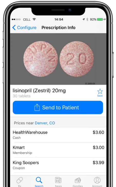
Original GoodRx Pro App
Understanding the Problem
In our initial assessment, we found GoodRx Pro’s interface outdated and lacking essential features like filters, recent searches, and quick access to common prescriptions. Its design didn’t align with the established GoodRx brand, making the app feel like an afterthought — potentially undermining trust and usability for doctors.
Finding the Solution
Our core strategy focused on brand cohesion. We identified early on that GoodRx Pro felt disconnected from the main GoodRx app, so we aligned visual elements like color, buttons, and typography to create a consistent experience. We also enhanced functionality by adding intuitive search, smart filters, and visual medication cards, helping doctors navigate the app more efficiently and confidently.
Key Improvements
My Role
This was a group project and my first time collaborating with teammates Devin and Krislyn. While we all contributed throughout, I focused on key screens such as the search interface, configure page, coupon and medication pages, and the send coupon screen. Devin supported layout consistency, while Krislyn led the medicine cabinet section. We initially faced challenges aligning our design styles but resolved them by dividing screen ownership and adhering to shared brand guidelines.


Our Redesigned GoodRx Pro App
Overcoming Challenges
The most significant hurdle was the collaborative design process. Each team member had a distinct design style, and this occasionally led to conflicting opinions on layout and interaction flow. To move forward effectively, we established clear design responsibilities and implemented shared branding elements across all screens. This created a sense of unity in the final product while allowing individual creativity to shine.
Medication cards for quick access
Medication images for faster identification
New UX flows that simplified the configuring process
Color integration for better visuals and brand identity
Impact on Users
Our redesign created a more efficient, recognizable, and user-friendly tool for healthcare professionals. By mimicking the design language of the consumer-facing GoodRx app, doctors experienced a more familiar interface — which contributed to faster navigation and less friction during use.
Together, these changes helped improve task efficiency and strengthened brand trust among professional users.
Project Reflection
This project reinforced two critical skills: brand-focused design and collaborative problem solving. Designing within an established brand identity challenged me to think beyond personal style and truly embrace consistency. Additionally, working with talented teammates who had strong design opinions taught me the importance of clear communication and compromise.
Understanding how to merge creative perspectives while staying grounded in UX best practices will be invaluable in my future collaborative work. Ultimately, our team delivered a product that felt polished, purposeful, and truly aligned with the GoodRx brand.